Radar charts
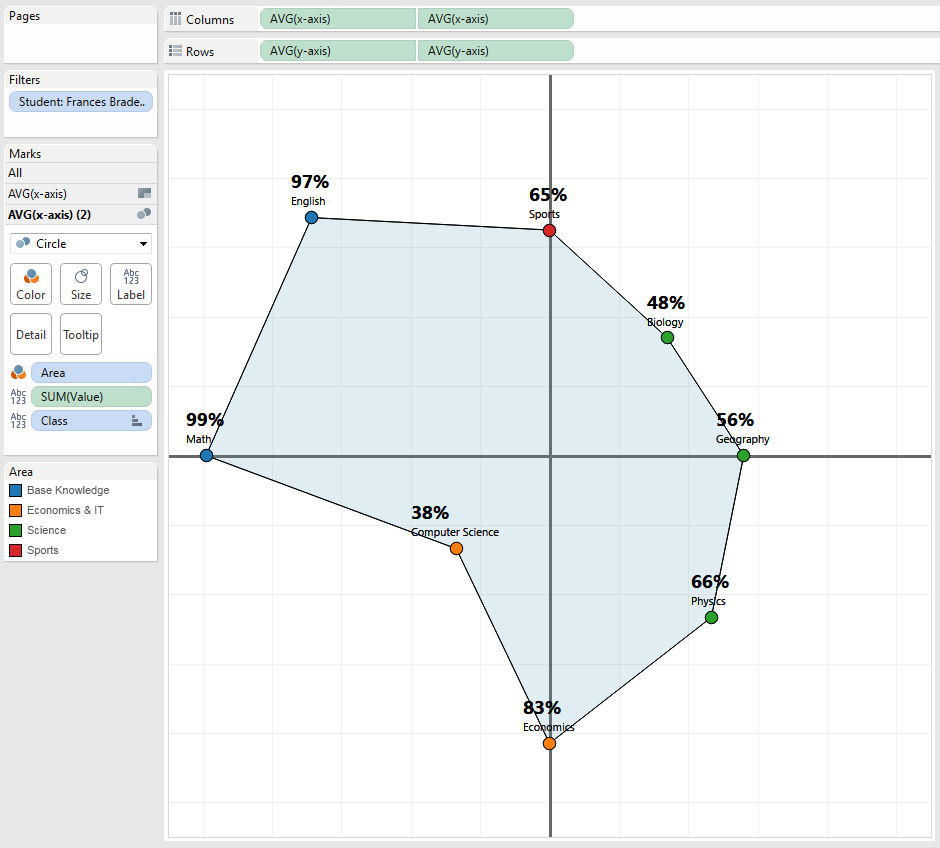
Radar charts is a two dimensional graph that allows for visualizing numerous amount of measures. Normally the number of measures would be at least 4 to give the radar charts it’s distinct shape. Many more measures can be displayed, each adding a new ’leg’ to graph. The radar chart is sometimes also referred to as a Spider chart.
The larger the value, the further the data point is plotted towards the outside of the graph. Larger values are typically considered positive when using a radar chart. The ‘best’ situation is when all the measures are plotted at the outer edge of the graph.
It’s advised to align and fix the scale of the measures. You can use one measure with a scale from 0 to 10000 and another measure with a scale between 0 and 100 but only if the relative increases of both measure mean as much. 5000 for the first measure should be similarly as good as 50 for the second measure otherwise the scale does not make sense. It’s therefore that radar charts are often used when visualizing scores or percentages as these are usually all based on the same scale (0-100).
Tableau does not support radar charts out of the box. As with a lot of things in Tableau, you can still imitate the look-and-feel of a radar chart using some nifty work-arounds.
Criticism
It’s important to note that use of a radar chart is very situational and as in most case a simple bar chart could very well be the better option.
The usecase for this demo
A teacher wants to visualize the scores of the students using a radar chart. Each student has 8 scores for various classes. The teacher wants to visualize these scores for each student separately.
Tableau
Data prep
First we will need to format our data into a certain format. This can be done in Excel, in a SQL query using joins, ..
What we need is something similar to this:
- Student - a column for the unit to with this group metrics apply
- Order - a column to indicate in which order Tableau needs to draw the lines. This could be calculated in Tableau as well with some use of the windowing calculations and
index(). - Class - the name of a measure
- Value - the value of a measure
| Student | order | Class | Value |
|---|---|---|---|
| Tess Roscoe | 1 | Math | 53 |
| Tess Roscoe | 2 | English | 55 |
| Tess Roscoe | 3 | Physics | 74 |
| Tess Roscoe | 4 | Economics | 83 |
| Tess Roscoe | 5 | Biology | 30 |
| Tess Roscoe | 6 | Geography | 81 |
| Tess Roscoe | 7 | Computer Science | 44 |
| Tess Roscoe | 8 | Sports | 42 |
| Sherrie Maitland | 1 | Math | 66 |
| Sherrie Maitland | 2 | English | 61 |
| Sherrie Maitland | 3 | Physics | 83 |
| Sherrie Maitland | 4 | Economics | 39 |
| Sherrie Maitland | 5 | Biology | 61 |
| Sherrie Maitland | 6 | Geography | 60 |
| Sherrie Maitland | 7 | Computer Science | 68 |
| Sherrie Maitland | 8 | Sports | 70 |
Once we have that set up we can move to Tableau.
Determining angles
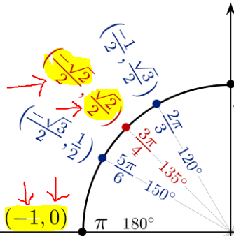
We are going to be plotting the values around a central point. To decide in what angle compared to this central point we will use trigonometric identities. These looks something like the following graph:

Now.. if you are a little confused; I’ll explain. It’s very simple, I promise.
Let’s say you have 8 measures to visualize. In this case we will need to pick 8 angles on which to plot your data. Wouldn’t it be great if could get Tableau to spread these out for us automatically? Unfortunately this is not the case but rather we need to pick the 8 angles and implement them ourselves.
Looking at the trigonometric identities we can simply pick 8 lines (vertical, horizontal and/or diagonal) that would nicely spread out the lines. 8 is a convenient number for this. If you have more measures or less measures, you will need to figure out which angles you need to pick to end up with an evenly distributed graph.
We can choose the 4 vertical and horizontal lines that pass the central point (the ones marked with 0°, 90°, 180° and 270°). Then we can pick the 4 diagonal lines marked with either 45°, 135°, 225° or 315°. These 8 lines will cause the plots to be evenly spread out.
Once we have decided with lines we need we are only interested in the two calculations indicated for each angle.
The first part indicates what we need to multiply the Value by for the X-axis.
The second part indicates what we need to multiply the Value by for the Y-axis
Creating calculated fields
We will create two calculated fields. Given the fields in my example dataset they look like the following, you will probably need to change to values to your use case. You might also need to add or remove entries depending on how many measures you want to visualize. Note that we are doing the multiplication of the Value field here according to the two numbers found in the image. We will use these two calculated fields to determine where te plot out data points.
x-axis
CASE [Class]
WHEN "Math" THEN [Value] * -1
WHEN "English" THEN [Value] *(-sqrt(2)/2)
WHEN "Physics" THEN 0
WHEN "Economics" THEN [Value] * (sqrt(2)/2)
WHEN "Biology" THEN [Value]
WHEN "Geography" THEN [Value] * (sqrt(2)/2)
WHEN "Computer Science" THEN 0
WHEN "Sports" THEN [Value] *(-sqrt(2)/2)
END
y-axis
CASE [Class]
WHEN "Math" THEN 0
WHEN "English" THEN [Value] * (sqrt(2)/2)
WHEN "Physics" THEN [Value]
WHEN "Economics" THEN [Value] * (sqrt(2)/2)
WHEN "Biology" THEN 0
WHEN "Geography" THEN [Value] * (-sqrt(2)/2)
WHEN "Computer Science" THEN [Value] * -1
WHEN "Sports" THEN [Value] * (-sqrt(2)/2)
END
Putting it all together
- Add x-axis field as AVG to Column shelf twice
- Change this to Dual Axis with synchronized axis
- Add y-axis field as AVG to Row shelf twice
- Change this to Dual Axis with synchronized axis
- Change the first pair of x-axis and y-axis to chart type Polygon
- Change the second pair of x-axis and y-axis to chart type Circle
- Add the Class field to the polygon part as path
- Sort this path by the Order field in the dataset
- Add a filter for the Student field
- On the Circles section you can add labels with the actual values
- Optional: Change the color of the Polygon to be transparent and add a border
- Optional: Add coloring of the circles by certain custom groupings.
After following those steps you should already have a decent result. Of course I would recommend doing some final tweaking. Don’t hesitate to reach out if you need some help!
You can also download the workbook from the embed Tableau Public at the top.


